Article Text

Statistics from Altmetric.com
- Litigation
- advertising and promotion
- harm reduction
- cigarette advertising
- branding
- packaging
- The One
- KT&G
- South Korea
- social marketing
- globalisation
- packaging and labelling
- public policy
Korea is regarded as the world's eighth largest cigarette market, which reflects a sizeable population of the country and roughly 40% of Korean men being smokers.1 ,2 Moreover, Korea has been identified as one of the lowest (machine-measured) tar delivery markets in the world. According to internal corporate documentation from Philip Morris, Korean smokers prefer lower (machine-measured) tar and nicotine products that are complemented with promotional appeals relating to luxury.3 The primary marketing communication channels utilised by tobacco firms in Korea appear to be the print media (ie, business and fashion magazines with a predominantly male readership, given legislation, the National Health Promotion Act, which stipulates that cigarette advertisements cannot be directed overtly towards women), retail merchandising (eg, ‘power-wall’ and sales-counter signage in convenience stores) and packaging.1
The Korean tobacco industry is dominated by four firms: Korean Tomorrow and Global (KT&G), Philip Morris International, Japan Tobacco International and British American Tobacco. KT&G has nearly a 70% market share, while Philip Morris International, Japan Tobacco International and British American Tobacco have a collective market share of approximately 30%.4 In this paper, we provide a semiotic analysis of packaging and promotions for KT&G's The One, which is a brand with a relatively low machine-measured tar delivery. Semiotics refers to the theory of signs, and offers an interpretive approach to the study of signs and produced meanings.5–7 As will be seen in this paper, The One packaging makes use of ‘white space’ to convey prestige, purity and healthiness; consequently, it is argued that the use of white is generally ill-advised for plain packaging prototypes. We present several examples to show that important obligations of the WHO's Framework Convention on Tobacco Control (WHO FCTC) have not been fulfilled to date in the Republic of Korea, despite the country hosting the fifth session of the Conference of the Parties to the WHO FCTC during 2012.
The One branding
Branding refers to the use of a name, symbol, design or logo to identify a product. Additional brand elements such as typography, colours, taglines and characters further contribute to the meaning and identification of products and differentiate them from competitors.8–10 Names and symbols can be important contributors to a brand's personality, image or perceived characteristics. The brand name, The One, has several possible connotations. The brand name may bring to mind the notion of ‘the one (and only)’, suggesting that the product cannot be duplicated, as well as consumers being brand insistent. A second possible interpretation of the brand name concerns market leadership, and being the number one brand in popularity or sales. Being number one or first is equivalent to being the best. Third, the brand name, The One, may signify the product's machine-measured tar delivery (ie, 1.0 mg), which may misleadingly offer ‘health reassurance’ with its supposed low tar delivery. Given the addictiveness of nicotine, smokers often engage in subconscious, compensatory behaviour when smoking lower yield cigarettes, including smoking the cigarette closer to the butt, taking deeper puffs from the cigarette, increasing the number of puffs taken while smoking the cigarette and smoking more cigarettes per day.11 Consequently, machine-measured numbers themselves are misleading, as tar and nicotine yields generated for cigarettes smoked by machines are appreciably lower than the yields actually delivered to compensating smokers.12–14 With The One exemplifying a brand name that conveys a supposed low tar delivery, there is the potential to circumvent policy in jurisdictions where ‘low tar’, ‘ultra-light’ and other such product descriptors are no longer allowable.
The One Blue, as seen in figure 1, is the parent brand with the earliest launch date (ie, 22 September 2003) of the brand family, which also consists of the following line extensions: Menthol, White, Orange and Impact. The One Blue, The One Menthol and The One Impact each have reported tar deliveries of 1.0 mg, whereas The One Orange and The One White have reported tar deliveries of 0.5 mg and 0.1 mg, respectively.15 Colours play an important role in the strategic branding of The One, and ‘menthol’ is likely to bring ‘green’ to the mind for consumers.16 ‘Impact’, meanwhile, has multiple meanings, including to have an influence or affect, to collide or strike, and to compress or press together. In the context of smoking, ‘impact’ may be seen as conveying a suitable and satisfying taste despite the brand's ‘low tar’ claim.

The One Blue packaging (front side and back side, respectively). The One Blue is regarded as the parent brand, with a reported tar delivery of 1.0 mg. The package was purchased at a convenience store in Korea during December 2010.
As seen in figure 1, the brand name is surrounded by a blue-coloured circle. A circle may symbolise perfection or wholeness as well as represent a boundary that serves to protect or confine what is found within.17 Moreover, a circle is an important symbol of Buddhism, which was introduced to Korea from China around the fourth century AD,18 and since then has greatly influenced Korean society, culture and the arts.19 In Korean Buddhism, the round circle (Ilwonsang) is a symbol of Oneness, and represents ‘the origin, or the perfect and integrated Dharma of the universe.’20 The tradition of the Seon school of Korean Buddhism (also known as Zen Buddhism) is to draw a round circle on the wall and to meditate on it.21
In the context of smoking, a circle may prompt a ‘smoke ring’ to come to mind. Alternatively, the symbol on the package may represent the letter ‘O’, being the first letter of ‘One’—the brand name—or ‘Oxygen’ as a means of directing attention to the product's ‘activated oxygen filter.’ The backside of the package claims that the product provides ‘An Enjoyable Experience of Oxygen.’ The largely white package gives the brand a ‘clean’ aesthetic look (similar to Apple's iPod); white is strategically regarded as a prestigious, expensive, high-end colour and may also signify confidence and financial strength, as well as purity and innocence.22 ,23 It is acknowledged that individual colours can have culturally-specific meanings and associations, but white commonly conveys ‘purity’ among Koreans,24 and it is noteworthy that the country's national flag uses ‘white space’ to signify ‘brightness and purity and reflects Koreans' peace-loving national trait.’25 Colour meanings and associations also have the potential for being product-specific; in the cigarette product category, white-dominated packages are generally meant to convey that a brand is supposedly ‘low tar’, signifying lower strength and reassurance to those with health concerns.16 ,26 ,27
The One advertising
The One advertising, as seen in figure 2, appeared in the 17 December 2007 issue of Business. The advertisement was placed inside the magazine's front cover, such that the cover could be turned to the right side, thereby exposing a two-page promotion. The copy of the advertisement is minimal, which is consistent with the theme of the advertisement.

Minimalism by THE ONE advertisement which appeared in the 17 December 2007 issue of Business.
‘Minimalism by THE ONE’ has several possible interpretations. Minimalism can refer to movements in visual art and design in which objects are sparse or stripped to their most essential features. Consistent with much minimalism in visual art, repetitive and simple geometric, cubic forms are featured in the advertisement. The person in the advertisement appears to be at an art gallery with the blue- and green-coloured circles potentially representing part of an art display. Among the two circles, the blue-coloured one is more prominent (ie, appearing nearer) and more closely resembles a cigarette package. A third, orange-coloured circle is depicted on the shirt of the person in the advertisement, being positioned at the centre of the person's chest. The orange-coloured circle is yet again more prominent (ie, appearing nearer and larger in size). Although The One Orange, The One Blue and The One Menthol cigarette packages are each depicted in the lower right corner of the advertisement, The One Orange might be seen as the ‘featured’ brand given the orange-coloured circle is the most prominently depicted in the main visual portion of the advertisement.
For the three cigarette packages shown in the lower right corner of the advertisement, the tar and nicotine levels for each brand variant or line extension are provided. The One Blue and The One Menthol have reported nicotine deliveries of 0.10 mg, whereas The One Orange has a reported delivery of 0.05 mg. On the front side of The One Orange package the message asserts ‘Ultra Low Tar and Sweet Flavor’ (in English), whereas for the Blue and Menthol packages the message states ‘Bamboo Charcoal Filter’ (in Korean) and ‘Fresh Feeling, Clean Mind’ (in English), respectively.
A general theme of the advertisement appears to be ‘less is more’ and the notion that simplicity is highly desirable. Beyond the visual art and design connotation, minimal may refer to a negligible amount or quantity, which has implications for perceptions about the reported tar and nicotine deliveries of the product. The One is also presented as fashionable, given the person in the advertisement is fashionable and slickly dressed; the person's dress style reflects that he is leisurely at an art exhibition or he is someone who works in the creative industry (in Korea, corporate business attire tends be conservative, consisting of a dark suit).
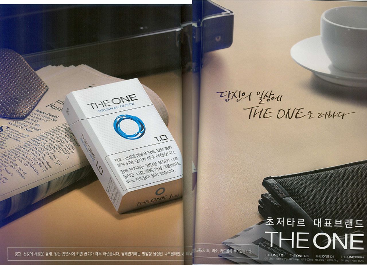
The two-page advertisement for The One, as seen in figure 3, has circulated in various magazines (eg, the October 2009 Korean editions of GQ, Arena and Luel and the December 2009 issue of Money). The most prominent advertisement copy, in Korean, states ‘Add The One to your daily life’, as well as The One being ‘The flagship, representative brand for ultra low tar.’ With the objects depicted, the advertisement copy serves as verbal anchoring for the implication that The One cigarettes should become part of a person's daily routine like reading the newspaper and drinking a cup of coffee.
A two-page advertisement promoting The One appeared in Korean editions of GQ, Arena and Luel during October 2009, as well as the December 2009 issue of Money. The most prominent advertisement copy, in Korean, states ‘Add The One to your daily life’, as well as The One being ‘The flagship, representative brand for ultra low tar.’
The implied user of The One is a Korean male, international business traveller, with the briefcase, tie, English language newspaper (Simon Daniel, who is a frequent contributor to the Financial Times, is identified as the author of the featured article), international airmail envelopes and Tumi business case on display. Tumi is self-proclaimed as ‘the leading international brand of luxury travel, business and lifestyle accessories… Tumi's commitment to design excellence, functional superiority and technical innovation has made it the brand of choice for the world's most discerning and demanding travelers.’28
The cigarette package seen in figure 3 is the parent brand, The One Blue, with copy on the package stating ‘Original Taste’ (in English) and ‘1.0’, which presumably indicates the reported tar delivery and is numerically consistent with the brand's name, and also possibly conveys high-technology, as in the first commercial release of software (eg, iOS 1.0). Despite the single package depicted, copy in small font, at the bottom right-hand portion of the advertisement, indicates various line extensions or brand variants offered and their corresponding reported tar and nicotine deliveries.
Discussion and conclusions
Our case illustration reveals that The One, from KT&G, is positioned as a brand representing creativity, minimalism and prestige. Marketing communication indicates enjoyment of life's simple pleasures as a product benefit, as well as health reassurance with a low reported tar delivery, use of ‘white space’ and activated oxygen filter. According to the tobacco industry's market research, ‘Besides strength, package design can make inferential statements that, in relative terms, the brand is a more clean and healthy alternative. The amount of white space makes a major contribution in this regard.’29 Package claims relating to ‘An Enjoyable Experience of Oxygen’ appear highly inappropriate given the health connotations of oxygen (eg, Oxygen is the name of a women's fitness magazine) and cigarette smoking has been linked to a number of health problems, including emphysema, in which the smoker's capacity to take up and use gaseous oxygen is impaired. An oxygen mask, which transfers breathing oxygen gas to the lungs, is meant to facilitate the capacity to breathe, whereas smoking is linked with shortness of breath and other respiratory problems.
Our case illustration, demonstrating the use of ‘white space’ on The One packaging, has important implications for plain packaging proposals and which colour is best advised for standardised use. Australia and New Zealand have put forward legislation requiring plain packaging for tobacco products; in Australia, all tobacco product packaging will utilise a dull olive hue. Brown and white have previously been offered in plain packaging prototypes, yet brown might convey naturalness (closely resembling the colour of a tobacco leaf) and white space can communicate prestige, purity and healthiness. Designers have long recognised the value and function of ‘white space’; advertising for Volkswagen automobiles and Stella Artois beer also serve as good examples of white space being utilised.23 Research findings provide support for the implementation of plain packaging regulations, but a direction for future research includes further examination of which standard colour tones are most likely to discourage tobacco consumption.30–33
The Republic of Korea ratified the WHO FCTC, effective 6 May 2005. Whereas relatively stringent indoor smoking policies have been implemented in Korea, it appears that several other important obligations of the WHO FCTC have not been fulfilled to date. For example, Article 6 identifies price and tax measures to reduce the demand for tobacco, yet the Korean retail price for a pack of The One cigarettes is ₩2500 (approximately US$2.50).15 Articles 9 and 10 call for a ban on cigarette flavours such as vanilla and honey, given their appeal to youth with increasing the palatability of cigarettes, yet marketing communication for The One Orange referred to its ‘sweet flavor.’ According to Article 11, tobacco packaging and labelling should not include terms such as ‘low tar’ and ‘ultra-light’, which are likely to be misleading about the product's harmfulness. Nevertheless, advertising claims relating to The One being an ‘ultra low tar’ brand persist. Health warnings should also account for 50% or more of the cigarette package's principle display area, and may also include the use of pictures, yet this is clearly not being observed in Korea to date. Article 13 stipulates that each Party shall have a comprehensive ban on tobacco advertising and promotion, in accordance with its constitutional principles, within 5 years of ratification (ie, 6 May 2010 for Korea). Nevertheless, Article 13 represents an additional obligation that has not been fulfilled given that tobacco advertising and promotion continue (eg, the January 2011 Korean editions of GQ, Maxim, Esquire and Arena include advertising for KT&G's Entz cigarette brand). Korea will host the fifth session of the Conference of the Parties to the WHO FCTC from 12 to 17 November 2012; hopefully, Korea will be able to demonstrate further progress in implementing obligations of the WHO FCTC at this session.
Acknowledgments
The authors would like to acknowledge Dr Geoffrey T. Fong for his support on the preparation of this article. Additionally, the authors thank Won-ho Lee for the help in acquiring the advertisements used in this paper.
References
Footnotes
-
Funding This study was supported by Ontario Institute for Cancer Research IA-004.
-
Competing interests None.
-
Provenance and peer review Not commissioned; externally peer reviewed.